
Have you ever wondered how your home stays comfortably warm in the winter and refreshingly cool in the summer?
The answer lies in the intricate workings of your home’s HVAC system.
But what exactly is an HVAC system, and how does it work?
In this comprehensive guide, we’ll take you on a journey through the fascinating world of HVAC systems, complete with easy-to-understand HVAC diagrams and expert insights.
So, whether you’re a curious homeowner or a DIY enthusiast, buckle up and get ready to dive in!
Table of Contents
- HVAC Basics
- Components of an HVAC System Diagram
- Types of HVAC Systems Diagram
- Detailed Home HVAC Diagram
- Understanding HVAC Diagrams
- Importance of HVAC Maintenance
- DIY vs. Professional Services
- Energy Efficiency and HVAC Systems Diagram
- HVAC System Installation Diagram
- Common HVAC Problems and Solutions Diagram
- HVAC Safety Considerations
- Conclusion: Recap and Final Thoughts on Home HVAC Diagrams

HVAC Basics
What Does HVAC Stand For?
First things first, let’s decode that HVAC acronym. HVAC stands for Heating, Ventilation, and Air Conditioning. It’s a system that’s designed to keep your home comfortable and your air quality high, no matter what the weather’s like outside.
- Heating: This part of the system keeps your home warm during those chilly winter months. It involves a furnace or heat pump that heats up air and circulates it throughout your home.
- Ventilation: This is all about maintaining good air quality. Ventilation systems remove stale indoor air, replacing it with fresh air from outside. They also help to control humidity levels and remove dust, allergens, and other airborne particles.
- Air Conditioning: This is what keeps you cool when the summer heat hits. An air conditioner removes heat from the indoor air and circulates the cooled air throughout your home.
The Role of HVAC in Home Comfort and Health

Now that we know what HVAC stands for, let’s talk about why it’s so important. Your home’s HVAC system plays a crucial role in maintaining a comfortable and healthy living environment.
- Comfort: A well-functioning HVAC system keeps your home at a comfortable temperature, no matter what the weather’s like outside. It also helps to control humidity levels, preventing your home from becoming too dry in the winter or too humid in the summer.
- Health: By improving air quality and ventilation, your HVAC system can help to reduce allergens and pollutants in your home. This can be especially important for people with allergies or asthma.
In the next sections, we’ll dive deeper into the different components of an HVAC system, different types of HVAC systems, and how to read and understand HVAC diagrams.
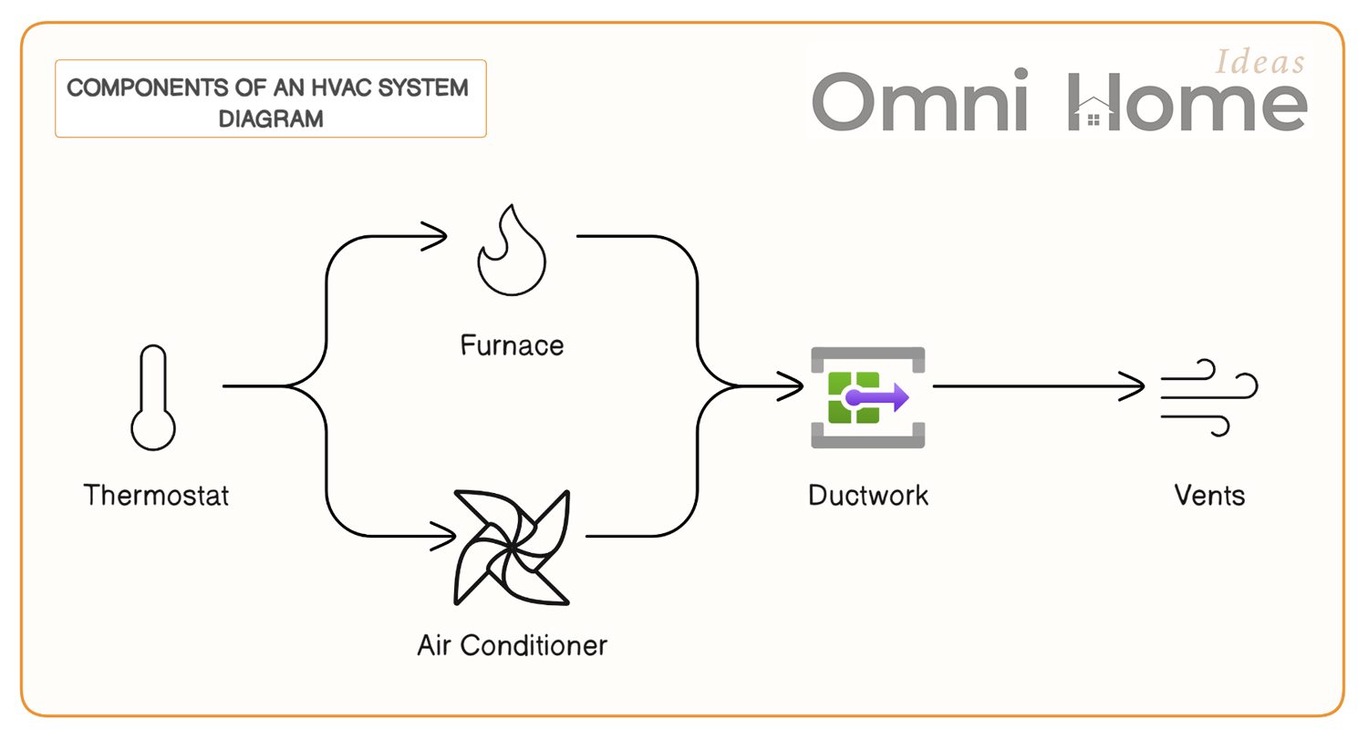
Components of an HVAC System Diagram
Now that we’ve covered the basics, let’s take a closer look at the main components of an HVAC system. These are the parts that work together to heat, cool, and ventilate your home.
The Heart of the System: Furnace and Air Conditioner
The furnace and the air conditioner are the powerhouses of your HVAC system. They’re responsible for heating and cooling the air in your home.
- Furnace: The furnace is the part of the system that provides heat. It does this by burning a fuel source (like natural gas, oil, or electricity) to heat air. This heated air is then circulated throughout your home.
- Air Conditioner: The air conditioner works to cool your home by removing heat from the indoor air. It does this through a process called refrigeration. Essentially, the air conditioner uses a refrigerant to absorb heat from the indoor air and release it outside, leaving the air inside your home cooler.
The Pathway: Ductwork and Vents
Once the air has been heated or cooled, it needs a way to get to the different rooms in your home. That’s where the ductwork and vents come in. To keep this airflow clean and efficient, ductwork cleaning is essential, as dust and debris buildup can reduce system performance and affect indoor air quality.
- Ductwork: The ductwork is like the highway system for your HVAC. It’s a network of tubes that carries heated or cooled air from the furnace or air conditioner to the various rooms in your home.
- Vents: Vents are the exit points for the air in your ductwork. They’re usually located on the floors, walls, or ceilings of your home. When the air exits the vents, it changes the temperature of your room.
The Control Center: Thermostat
The thermostat is like the brain of your HVAC system. It’s what controls the temperature in your home.
- Thermostat: The thermostat monitors the temperature in your home and sends signals to the furnace or air conditioner to turn on or off based on the temperature settings you’ve chosen. Some thermostats are programmable, allowing you to set different temperatures for different times of the day.
In the next section, we’ll explore the different types of HVAC systems and how they might be the best fit for different types of homes.
Types of HVAC Systems Diagram
Just like there are different types of cars for different needs, there are also different types of HVAC systems. Each type has its own advantages and may be a better fit for certain types of homes or climates. Let’s take a look at some of the most common types.
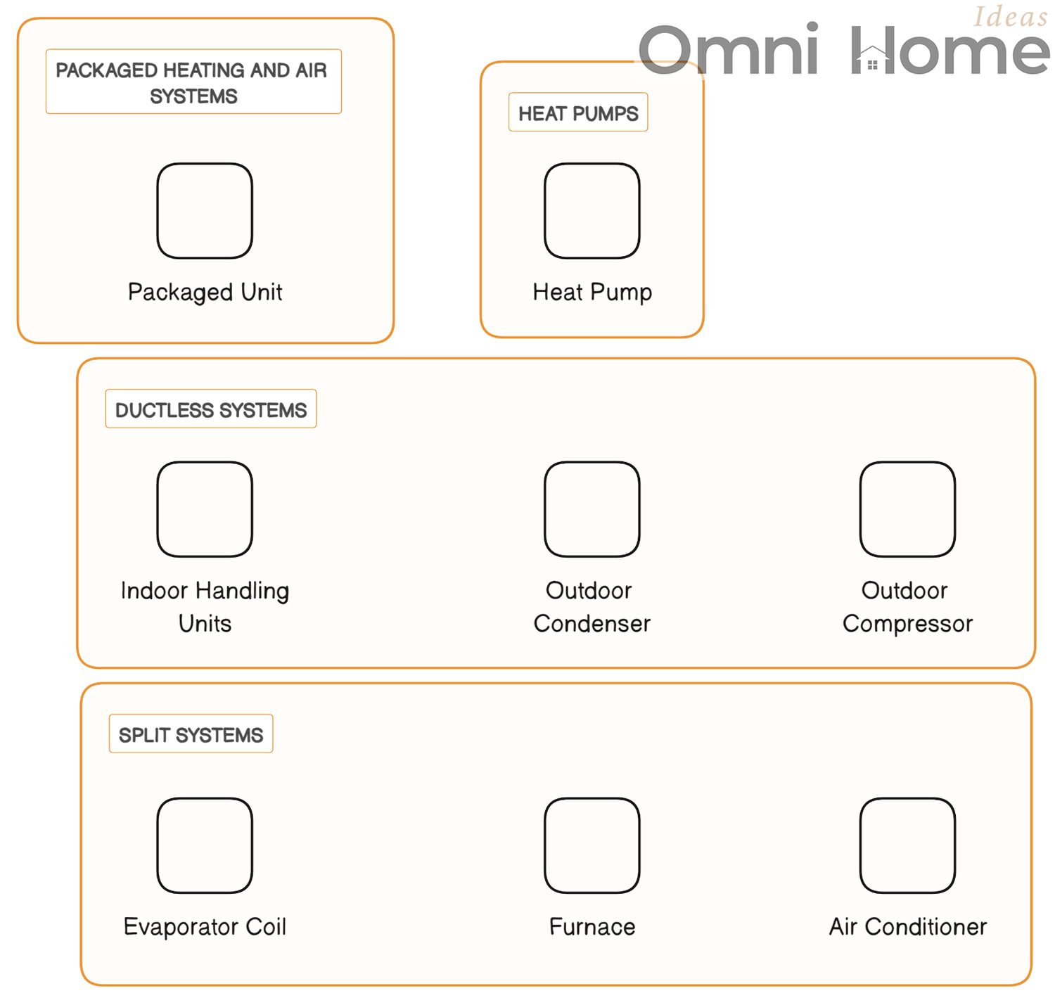
Split Systems: The Most Common Choice
Split systems are the most common type of HVAC system you’ll see in homes. As the name suggests, these systems are “split” into two main components.
- Indoor Component: This includes the furnace and the evaporator coil for the air conditioner. These are usually located inside your home, often in a basement, attic, or dedicated closet.
- Outdoor Component: This is the condenser coil and compressor for the air conditioner. It’s typically located outside your home, on a concrete slab or other platform.
Split systems are popular because they’re efficient and effective. However, they do require ductwork to distribute the air, which can be a disadvantage in homes where installing ductwork is difficult or impossible.
Comparing Types of HVAC Systems
| Type of System | Description | Best For |
|---|---|---|
| Split System | Consists of an outdoor unit housing the compressor and condenser, and an indoor unit housing the evaporator coil and blower. | Homes with existing ductwork. |
| Ductless System | Also known as a mini-split system, it has an outdoor compressor/condenser and indoor air-handling units. | Homes without ductwork, smaller spaces, or areas requiring individual temperature control. |
| Packaged Heating and Air System | Combines the compressor, condenser, and evaporator in a single unit, usually placed on a roof or a concrete slab near the house. | Homes with limited indoor space, typically in warmer climates. |
| Heat Pump | Uses electricity to move heat from a cool space to a warm space, making the cool space cooler and the warm space warmer. | Homes in mild climates. |
Ductless Systems: A Flexible Alternative
Ductless systems, also known as mini-split systems, are a great alternative for homes where installing ductwork isn’t feasible. These systems consist of an outdoor unit and one or more indoor units, which are connected by a small conduit.
Each indoor unit can be controlled independently, allowing you to adjust the temperature in different rooms or “zones” separately. This can be more energy-efficient, as you can cool or heat only the rooms that are being used.
Packaged Heating and Air Systems: Compact and Convenient
Packaged heating and air systems are compact units that contain all the components of an HVAC system in one outdoor unit. These systems are typically installed on the roof or on a concrete slab next to the home.
While they’re not as common as split or ductless systems, packaged systems can be a good choice for homes with limited indoor space. They’re also often used in small commercial buildings.
Heat Pumps: Efficient and Versatile
Heat pumps are a type of HVAC system that can provide both heating and cooling. They work by moving heat from one place to another – extracting heat from the air outside to heat your home in the winter, and removing heat from your home to cool it in the summer.
Heat pumps can be incredibly energy-efficient, especially in mild climates. They can also be used in combination with a furnace in a “dual fuel” system, which can provide efficient heating in a wider range of climates.
In the next section, we’ll dive into the world of HVAC diagrams. We’ll explain how to read and understand them, and even how to create your own.
Detailed Home HVAC Diagram
In this section, we delve into a more detailed diagram of a typical residential HVAC system. This diagram represents a split system, which is one of the most common types of HVAC systems in residential homes.
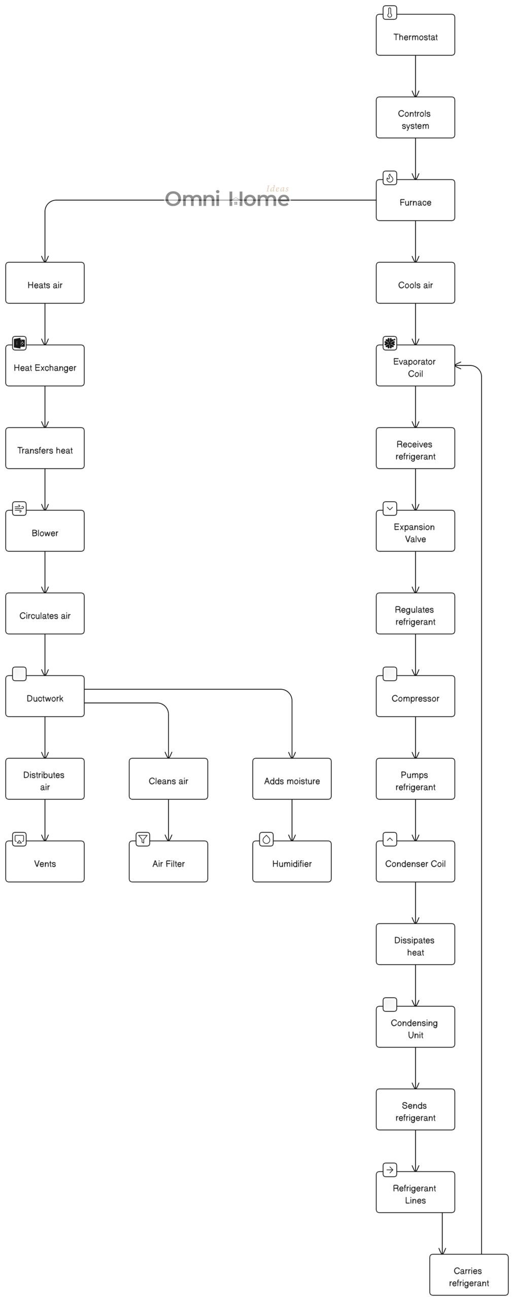
Let’s break down the components of this system:
- Thermostat: This is the control panel for your HVAC system. You set your desired temperature here, and the thermostat signals the rest of the system to heat or cool the home accordingly.
- Furnace: The furnace is responsible for heating air. It does this via a heat exchanger.
- Heat Exchanger: The heat exchanger is located inside the furnace. It transfers heat to the air that is circulated by the blower.
- Blower: The blower circulates air through the system. It pushes air over the heat exchanger (for heating) or the evaporator coil (for cooling), and then sends it through the ductwork.
- Evaporator Coil: Located inside or near the furnace, the evaporator coil cools the air when the thermostat is set to a lower temperature.
- Condensing Unit: This unit is located outside the home and is responsible for dissipating heat from the refrigerant which has absorbed heat from the inside of the house.
- Compressor: Located inside the condensing unit, the compressor pumps refrigerant through the system.
- Condenser Coil: Also located in the condensing unit, the condenser coil dissipates heat from the refrigerant, transforming it from a high temperature gas to a cooler liquid.
- Expansion Valve: This valve regulates the amount of refrigerant going into the evaporator coil, ensuring it operates efficiently.
- Refrigerant Lines: These lines carry refrigerant between the condensing unit and the evaporator coil.
- Ductwork: The ductwork circulates air throughout your home. It carries cooled air from the evaporator coil and heated air from the furnace to the vents.
- Air Filter: Located within the ductwork, the air filter cleans the air that circulates through the system, removing dust, allergens, and other particles.
- Humidifier: The humidifier adds moisture to the air during heating, which can help to alleviate dry skin and other issues associated with dry air.
- Vents: The vents distribute the heated or cooled air into each room in your home.
This detailed HVAC diagram provides a more comprehensive view of how the various components of your HVAC system work together to heat and cool your home. Understanding this can help you maintain your system more effectively and identify potential issues that may require attention.
Understanding HVAC Diagrams
HVAC diagrams can look like a complex web of lines and symbols if you’re not familiar with them. But don’t worry, they’re not as intimidating as they seem! Let’s break down how to read and understand these diagrams.
Decoding Symbols and Abbreviations in HVAC Diagrams
HVAC diagrams use a variety of symbols and abbreviations to represent different components and connections. Here are some of the most common ones you might see:
- Furnace: Often represented by a square or rectangle with lines or waves to indicate heat.
- Air Conditioner: Typically shown as a circle or a coil, often with arrows to represent the flow of air.
- Ductwork: Usually shown as lines or tubes connecting different components.
- Vents: Often represented by small rectangles or circles along the ductwork.
- Thermostat: Typically shown as a small box, sometimes with a “T” or other symbol.
You might also see various abbreviations, such as “AC” for air conditioner, “H” for heat or heater, and “V” for ventilation.
Reading a Home HVAC Diagram: A Step-by-Step Guide
When you’re reading an HVAC diagram, it can be helpful to start at the thermostat, since that’s the control center of the system. From there, you can follow the lines (representing the ductwork) to the different components.
Remember, the furnace and air conditioner are usually located close to each other, often in a basement or utility room. The ductwork then carries the heated or cooled air from these units to the various rooms in your home.
As you’re reading the diagram, try to identify the different components and understand how they’re connected. Don’t worry if you don’t understand everything right away – HVAC systems can be complex, and it’s okay to take your time!
Creating Your Own Home HVAC Diagram: Why and How
Creating your own HVAC diagram can be a great way to understand your home’s system better. It can also be a useful tool for planning renovations or troubleshooting problems.
To create your own diagram, start by sketching the layout of your home. Then, locate the main components of your HVAC system (the furnace, air conditioner, and thermostat) and add them to your sketch. From there, you can draw in the ductwork, following the path from the furnace and air conditioner to the vents in each room.
Remember, your diagram doesn’t have to be perfect. The goal is to help you understand your HVAC system better, not to create a professional blueprint!
In the next section, we’ll talk about the importance of regular HVAC maintenance and how it can save you money in the long run.
Importance of HVAC Maintenance

Just like your car needs regular oil changes and tune-ups to keep running smoothly, your HVAC system needs regular maintenance to stay in top shape. Let’s talk about why HVAC maintenance is so important and how it can benefit you.
Regular Check-ups: The Key to HVAC Health
Regular check-ups are crucial for keeping your HVAC system healthy. During a check-up, a professional technician will inspect your system, clean important components, and check for any potential issues. You can easily find a trusted HVAC contractor in Spanaway, so if you are in the area, make sure to schedule regular maintenance for your system. Whether it’s once a year or every few months, regular check-ups can save you from costly repairs down the line.
Here’s what a typical HVAC check-up might include:
- Cleaning: The technician will clean the coils, blower components, and other parts of your system. This can help your system run more efficiently and prevent problems down the line.
- Inspection: The technician will inspect your system for any potential issues, such as leaks, corrosion, or worn parts. Catching these issues early can prevent more serious problems in the future.
- Tune-up: The technician will also perform a tune-up, which might include lubricating moving parts, checking the refrigerant level, and making sure all controls are working properly.
Potential Energy Savings from Regular Maintenance
One of the biggest benefits of regular HVAC maintenance is the potential energy savings. A well-maintained HVAC system can run more efficiently, which means it uses less energy to heat or cool your home.
Here’s how regular maintenance can help save energy:
- Cleaning: When components like coils and blowers are clean, they can heat or cool air more efficiently. This means your system doesn’t have to work as hard, which can save energy.
- Tune-up: During a tune-up, the technician will make sure all parts of your system are working properly. This can help your system run more smoothly and efficiently, which can save energy.
- Early detection: Regular check-ups can catch potential issues early, before they cause your system to run less efficiently. This can prevent energy waste and save you money on your energy bills.
Increasing the Lifespan of Your HVAC System
Regular maintenance can also help increase the lifespan of your HVAC system. Just like regular oil changes can help your car last longer, regular check-ups can help your HVAC system keep running smoothly for years to come.
In the next section, we’ll discuss when it’s best to handle maintenance tasks yourself and when it’s time to call in a professional.
DIY vs. Professional Services

When it comes to HVAC maintenance, some tasks can be handled by homeowners, while others are best left to professionals. Let’s break down which tasks fall into each category.
When to DIY: Simple Maintenance Tasks
There are several simple maintenance tasks that most homeowners can handle on their own. These include:
- Changing the Air Filter: The air filter in your HVAC system should be changed regularly, usually every 1-3 months depending on the type of filter and how often your system is running. This is a simple task that involves removing the old filter and replacing it with a new one. A common size like 20x20x1 is often used in systems such as those by Carrier, Lennox, or Trane, but always check your unit’s specifications to ensure the correct fit.
- Cleaning Around Outdoor Units: It’s important to keep the area around your outdoor units clear of leaves, grass, and other debris. This can help your system run more efficiently and prevent damage.
- Checking the Thermostat: Make sure your thermostat is working properly and is set to the right temperature. If your home isn’t reaching the temperature you set, it could be a sign of a problem.
When to Call a Pro: Complex Repairs and Installations
While there are some tasks you can handle on your own, there are others that should be left to a professional. These include:
- Regular Check-ups: As we discussed earlier, regular check-ups are an important part of HVAC maintenance. These should be performed by a professional technician who has the knowledge and tools to inspect and tune-up your system.
- Repairs: If your system isn’t working properly, it’s usually best to call a professional. HVAC systems are complex, and trying to fix a problem on your own could end up causing more damage.
- Installations: Installing a new HVAC system or replacing parts of your existing system is a job for a professional. This ensures the job is done correctly and safely.
Remember, while DIY maintenance can save money in the short term, trying to handle complex tasks on your own can end up costing more in the long run if you end up damaging your system. When in doubt, it’s always best to call a professional.
In the next section, we’ll discuss how your HVAC system impacts your home’s energy use and how you can make your system more energy-efficient.
Energy Efficiency and HVAC Systems Diagram
HVAC systems play a significant role in your home’s energy use. In fact, heating and cooling often account for the largest portion of a home’s energy bill. But don’t worry, there are ways to make your HVAC system more energy-efficient!
Typical HVAC vs Energy-Efficient HVAC System Diagram
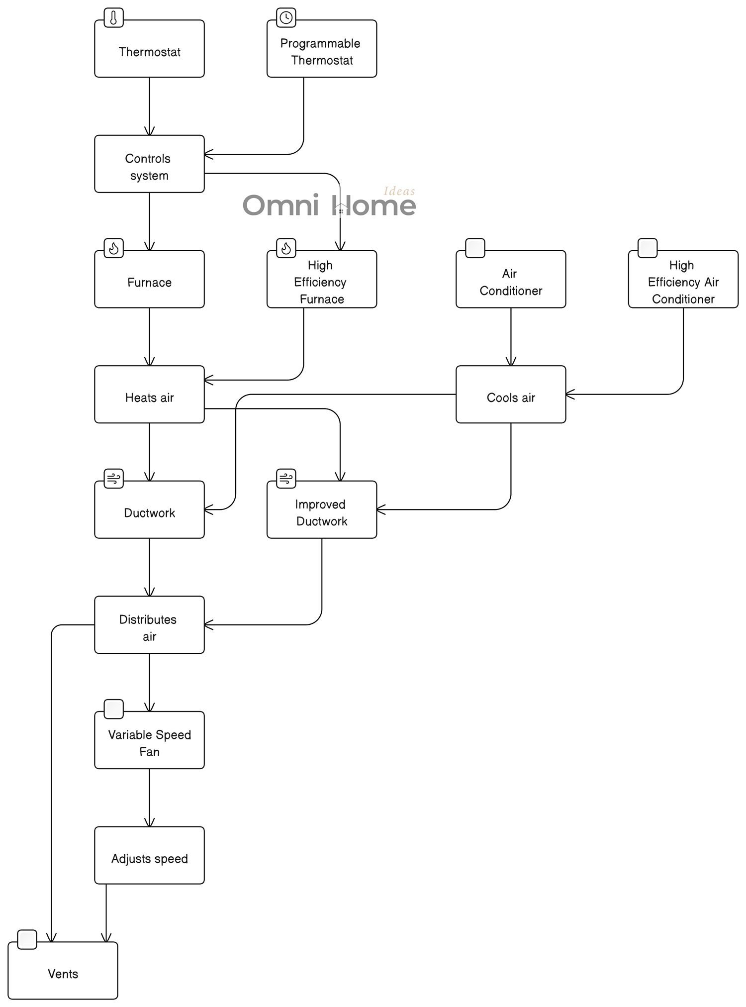
The diagram above compares a typical HVAC system with an energy-efficient HVAC system.
Please note that this is a simplified version of a real-world HVAC system. HVAC systems can vary greatly in complexity and configuration depending on the specific requirements of the building they are installed in.
This diagram includes the following components:
- Thermostat: Controls the HVAC system.
- Furnace: Heats air.
- Air Conditioner: Cools air.
- Ductwork: Distributes air throughout your home.
- Vents: The vents distribute the heated or cooled air into each room in your home.
For the energy-efficient HVAC system:
- Programmable Thermostat: Allows you to set your HVAC system to use less energy when you’re not home or when you’re asleep.
- High-Efficiency Furnace: Uses less energy to heat air.
- High-Efficiency Air Conditioner: Uses less energy to cool air.
- Improved Ductwork: Better-insulated and sealed ductwork reduces energy loss as air is distributed throughout your home.
- Variable Speed Fan: Adjusts its speed based on the current needs of the HVAC system, which can result in significant energy savings.
In a typical HVAC system, energy is consumed by various components such as the furnace, air conditioner, and ductwork. Each component uses a certain amount of energy to function, and this is represented by the size of the arrows in the diagram.
On the other hand, an energy-efficient HVAC system uses less energy to perform the same functions. This is achieved through several means:
- Efficient Components: Energy-efficient HVAC systems often include high-efficiency furnaces and air conditioners that use less energy to heat or cool the air.
- Programmable Thermostats: These allow you to set your HVAC system to use less energy when you’re not home or when you’re asleep.
- Variable Speed Fans: These fans adjust their speed based on the current needs of the HVAC system, which can result in significant energy savings.
- Improved Ductwork: Energy-efficient systems often include better-insulated and sealed ductwork, which reduces energy loss as air is distributed throughout your home.
By understanding how energy is used in your HVAC system, you can make informed decisions about potential upgrades or changes to your system that could result in significant energy savings.
The Role of HVAC in Home Energy Use
HVAC systems can use a lot of energy, especially during extreme weather when your heating or cooling system is working overtime. This is why it’s so important to make sure your system is running efficiently. An inefficient system can waste energy, leading to higher energy bills.
Choosing Energy-Efficient HVAC Models
If you’re in the market for a new HVAC system, choosing an energy-efficient model can be a great way to save energy and reduce your energy bills. Look for systems that have a high Seasonal Energy Efficiency Ratio (SEER) for air conditioners, and a high Annual Fuel Utilization Efficiency (AFUE) for furnaces. These ratings indicate how efficiently the systems use energy.
Also, consider choosing a system that is Energy Star certified. Energy Star is a program run by the U.S. Environmental Protection Agency and the U.S. Department of Energy that certifies energy-efficient products.
Tips for Maximizing HVAC Energy Efficiency
Even if you’re not in the market for a new HVAC system, there are still ways to make your existing system more energy-efficient:
- Regular Maintenance: As we’ve discussed, regular maintenance can help your system run more efficiently. This includes changing the air filter regularly and having regular check-ups performed by a professional.
- Programmable Thermostat: A programmable thermostat can help save energy by automatically adjusting the temperature at different times of the day. For example, you can set it to use less heating or cooling when you’re not home.
- Sealing Ductwork: Leaky ducts can waste a lot of energy by allowing heated or cooled air to escape. Having your ductwork professionally sealed can help prevent this.
- Insulation: Proper insulation can help keep your home at a comfortable temperature with less need for heating and cooling. This includes insulation in your walls, attic, and around your ductwork.
In the next section, we’ll discuss the process of installing an HVAC system and why proper sizing is so important.
HVAC System Installation Diagram
Installing an HVAC system is a complex process that should be left to professionals. But it’s still helpful for homeowners to understand the basics. Let’s dive into the importance of proper sizing and the process of professional HVAC installation.
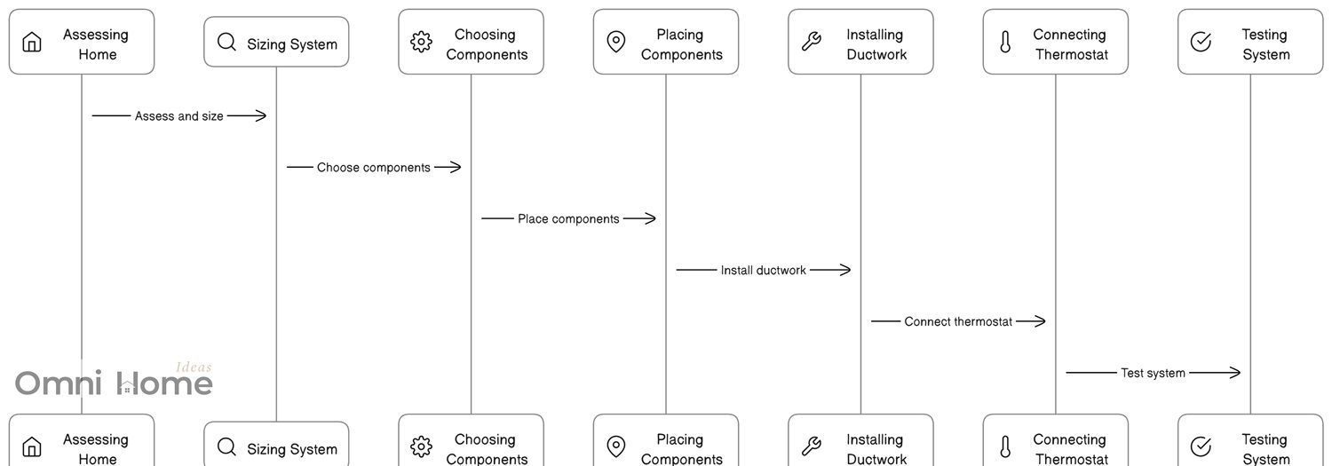
The diagram above illustrates the following steps in the HVAC system installation process:
- Assessing the Home: This includes measuring the size of the home, checking the insulation, and considering the local climate. These factors will influence the size and type of HVAC system you need.
- Sizing the System: Based on the assessment of the home, you can determine the right size of HVAC system. This is crucial for the system’s efficiency and effectiveness.
- Choosing the Components: This involves selecting the furnace, air conditioner, and other components based on the size of the system and the specific needs of the home.
- Placing the Components: Each component needs to be placed in a specific location. For example, the furnace is typically placed in a basement or utility room, the air conditioner is placed outside, and the ductwork is installed in the walls or ceiling.
- Installing the Ductwork: The ductwork connects all the components. It needs to be installed in a way that allows for efficient air flow.
- Connecting the Thermostat: The thermostat is what you use to control the system. It needs to be connected to the system and placed in a location where it can accurately measure the temperature of the home.
- Testing the System: The final step is to test the system to make sure everything works correctly. This includes checking that the system heats and cools properly and that air is being distributed evenly throughout the home.
Understanding this process can help you ensure that your HVAC system is installed correctly, which can improve its efficiency and longevity.
The Importance of Proper Sizing
When it comes to HVAC systems, bigger isn’t always better. In fact, a system that’s too large for your home can be less efficient and less effective at maintaining a comfortable temperature.
On the other hand, a system that’s too small may not be able to adequately heat or cool your home, especially during extreme weather. It may also have to work harder, which can lead to more wear and tear and a shorter lifespan.
This is why proper sizing is so important. A professional HVAC technician can perform a load calculation to determine the right size system for your home. This calculation takes into account factors like the size and layout of your home, the type and amount of insulation, the number and type of windows, and more.
The Process of Professional HVAC Installation
The process of installing an HVAC system involves several steps:
- Removing the Old System: If you’re replacing an existing system, the first step is to remove the old equipment. This includes the indoor and outdoor units, as well as any old ductwork that’s being replaced.
- Installing the New System: The new system is then installed. This includes the indoor unit (like a furnace or air handler), the outdoor unit (like an air conditioner or heat pump), and the ductwork.
- Connecting the System: The indoor and outdoor units are connected with refrigerant lines. The system is also connected to your home’s electrical system and, for furnaces, your home’s gas line.
- Testing the System: Once everything is installed and connected, the technician will test the system to make sure it’s working properly. This includes checking that the system is heating and cooling effectively, that the airflow is good, and that there are no leaks in the ductwork.
Remember, installing an HVAC system is a job for a professional. While it can be tempting to try to save money with a DIY installation, this can often lead to problems down the line.
In the next section, we’ll discuss some common HVAC problems and how to troubleshoot them.
Common HVAC Problems and Solutions Diagram
Even the best HVAC systems can run into problems from time to time. But don’t worry, many common issues can be easily fixed. Let’s take a look at some of the most common HVAC problems and how to troubleshoot them.

The diagram above illustrates the following common HVAC problems and their solutions:
- Leaks: Leaks can occur in the air conditioner or furnace. To troubleshoot this issue, check the drain pan and condensate line for blockages or damage. If the problem persists, you may need to call a professional.
- Thermostat Issues: If your thermostat is malfunctioning, it can cause your HVAC system to heat or cool improperly. Check the wiring and settings on your thermostat. If you can’t find the issue, it may be best to call a professional.
- Poor Airflow: Poor airflow can result from a dirty air filter or issues with the ductwork. Check your air filter and replace it if it’s dirty. If the problem persists, inspect your ductwork for blockages or leaks.
- Noisy System: If your furnace or air conditioner is making unusual noises, it could be due to loose parts. Check your system for any loose or damaged components. If you can’t find the issue, it may be best to call a professional.
- System Not Heating or Cooling: If your system is not properly heating or cooling, check the thermostat settings and refrigerant levels. If these are not the issue, you may need to call a professional.
By understanding these common HVAC problems and their solutions, you can ensure your system operates efficiently and lasts for many years.
When to Call a Professional: Recognizing Serious HVAC Problems
While some HVAC problems can be fixed with simple troubleshooting, others require the expertise of a professional. If you’re experiencing persistent issues with your system, or if you notice signs of a serious problem (like strange noises, a burning smell, or frequent cycling), it’s best to call a professional.
Remember, regular maintenance can help prevent many common HVAC problems. By keeping your system in good shape, you can enjoy a comfortable home and avoid unexpected repairs.
In the next section, we’ll wrap up with some final thoughts on home HVAC systems.
HVAC Safety Considerations

While HVAC systems are designed to keep us comfortable, it’s important to remember that they also need to be operated and maintained safely. Let’s discuss some key safety considerations.
The Importance of Carbon Monoxide Detectors
If you have a gas furnace, it’s crucial to have a carbon monoxide detector in your home. Carbon monoxide is a colorless, odorless gas that can be deadly if inhaled in large amounts. A detector can alert you if there’s a leak in your furnace, allowing you to get to safety and call a professional.
Regular Inspections for Safety
Regular inspections by a professional can help ensure your HVAC system is operating safely. The technician can check for potential safety issues, such as gas leaks, electrical problems, or issues with the venting of exhaust gases.
Safe DIY Practices for HVAC Maintenance
If you’re performing DIY maintenance on your HVAC system, it’s important to do so safely. Always turn off the power to your system before working on it, and be careful not to touch any electrical components. If you’re unsure about something, it’s always best to call a professional.
Conclusion: Recap and Final Thoughts on Home HVAC Diagrams
Understanding your home HVAC system can seem daunting, but with a little knowledge and the right resources, it’s a task that any homeowner can tackle. From understanding the basic components of your system, to reading and creating your own HVAC diagrams, to recognizing common problems and knowing when to call a professional, we’ve covered a lot of ground in this article.
Remember, your HVAC system is a crucial part of your home. It keeps you comfortable in all seasons, and with proper care and maintenance, it can serve you well for many years. Whether you’re a new homeowner or just looking to learn more about your HVAC system, we hope this guide has been helpful.
Remember to always prioritize safety, whether you’re performing routine maintenance or dealing with a potential problem. And don’t hesitate to call a professional if you’re unsure about something – it’s always better to be safe than sorry.
Thanks for reading, and here’s to a comfortable, well-regulated home!